We develop our theme with easy-customization in mind, to make sure it is easy to install and use without any web development experience needed. But, if you have any problem or issue related to this theme and couldn’t find information you need in this user guide, you can contact our support team.
We are eager to assist you in resolving any theme-related issues. Our team is dedicated to providing exceptional customer support, and we are happy to help you overcome any challenge you may encounter while using our product. Please do not hesitate to reach out to us if you have any questions, concerns or suggestions. We value your feedback and are committed to ensuring your satisfaction with our theme.
Installation
To install the theme, follow these steps.
- Download the package after purchasing it from Templatemonster
- Extract the package and find zora-theme-x.x.x.zip. (x.x.x is the theme version)
- Upload the zip file into your shopify online store
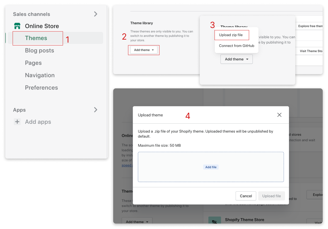
Upload Theme ZIP File
- Go to your online store admin, find Themes menu
- Click Add theme
- Select Upload zip file
- Add the zip file to upload form
Theme Settings
Discover a range of customization options in the Theme Settings, including colors, typography, social media links, search functionality, and more. Take note that any modifications made here will impact the appearance and functionality of your entire online store.
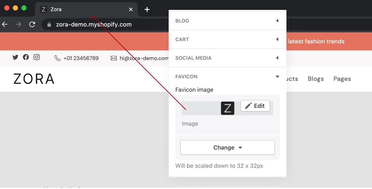
Favicon
Logo
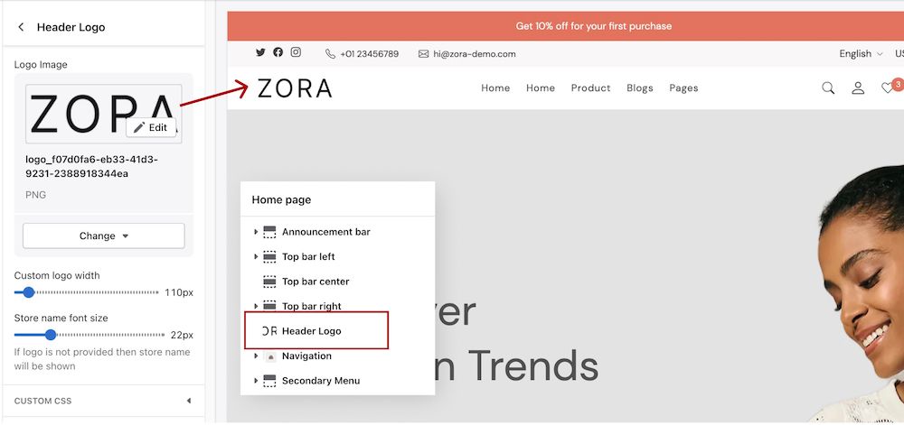
Required Apps
Product Review
This app will be used to show product rating and reviews. It's a free app made by Shopify, you can install this app from Shopify App Store
 Shopify App StoreFacebookTwitterYouTubeInstagramLinkedInPinterest
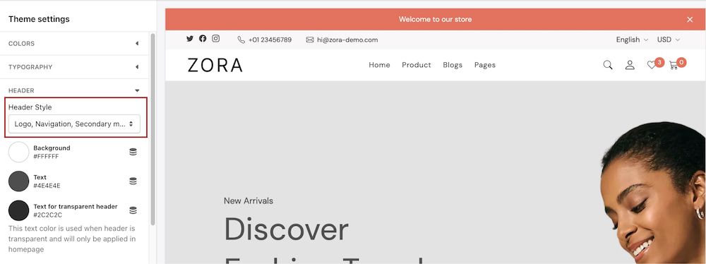
Header
The header offers three distinctive styles, including:
Header Style 1
Logo on the left and navigation in the center
Header Style 2
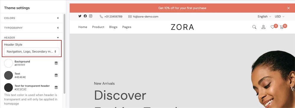
Logo in the center and navigatoin in the left
Header Style 3
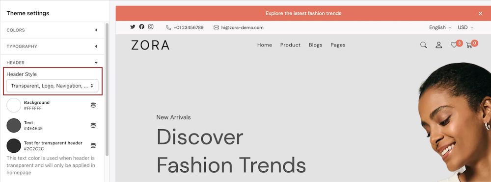
Logo on the left just like in style 1, but the background will be transparent.
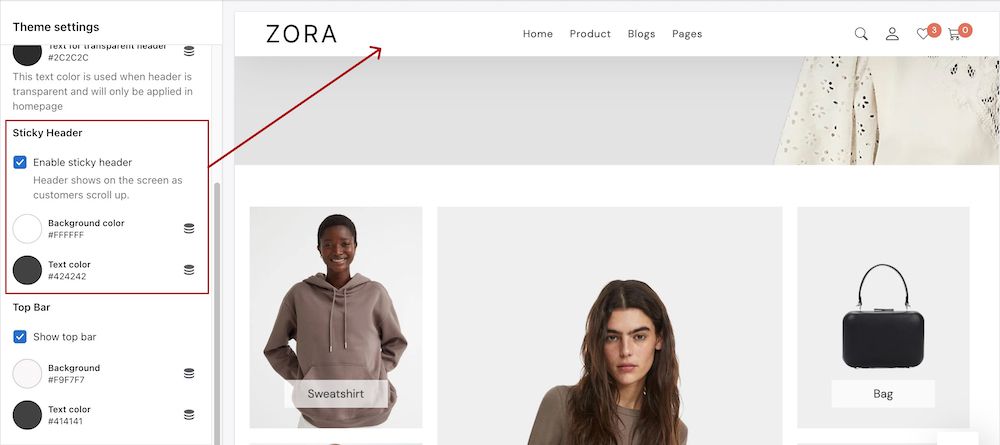
Sticky Header
To set header as sticky header, go to Theme settings > Header > Sticky header
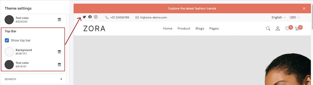
Top Bar
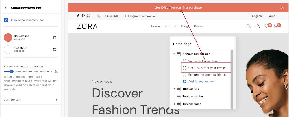
Announcement Bar
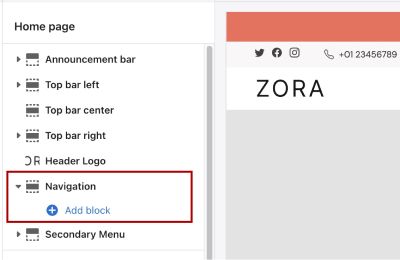
Navigation
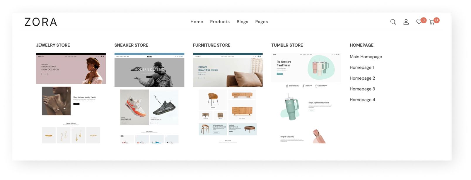
This theme supports both a standard 3 tier dropdown navigation and full-width mega menu. The mega menu navigation offers a choice of three unique layouts, which can be selected in the theme navigation section.
Basic Dropdown Menu
Here's how to add menu to your navigation
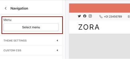
Step 1
Click navigation section
Step 2
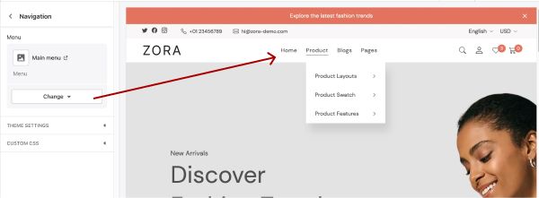
Select your menu.
This is the results.
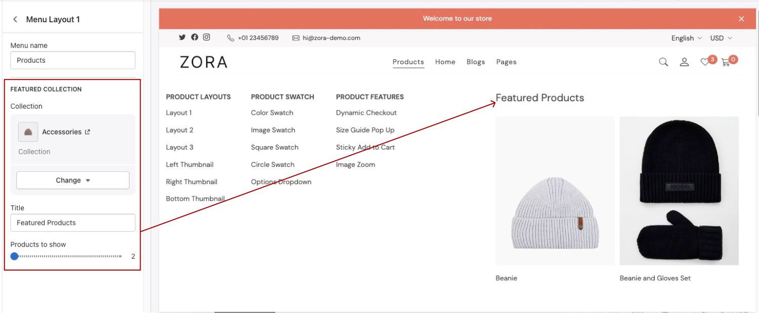
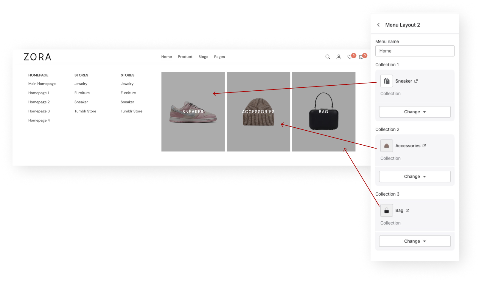
How to Show Mega Menu
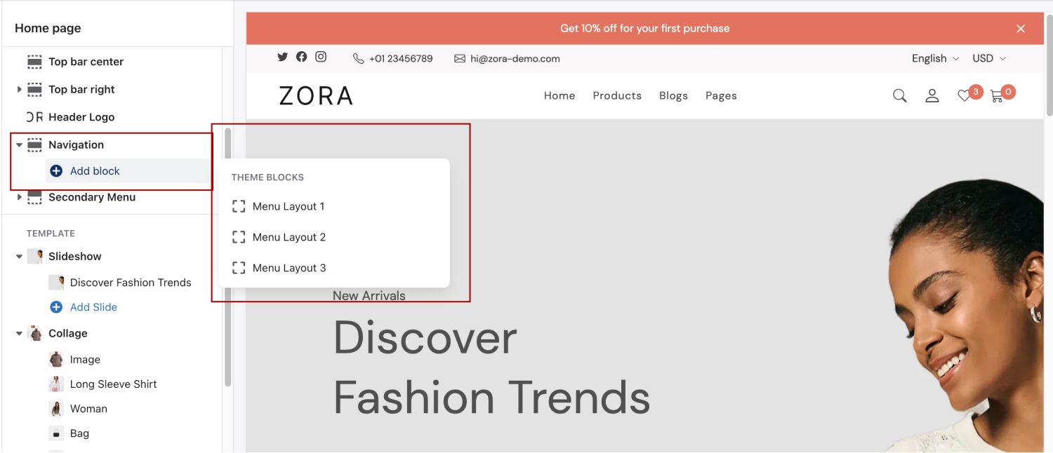
Step 1
Click "Add block" and choose a menu layout
Step 2
Fill the menu name from your menu. Make sure the name is correct
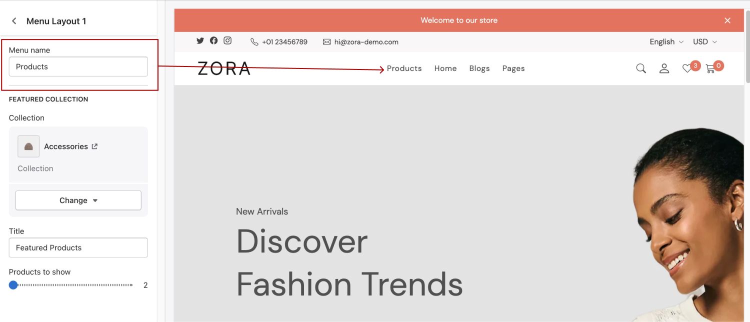
Step 3
Add more customization to the mega menu
Products
You can access product settings in Theme settings > product. This product settings has three sub settings, Product card, Label, and Product variant.
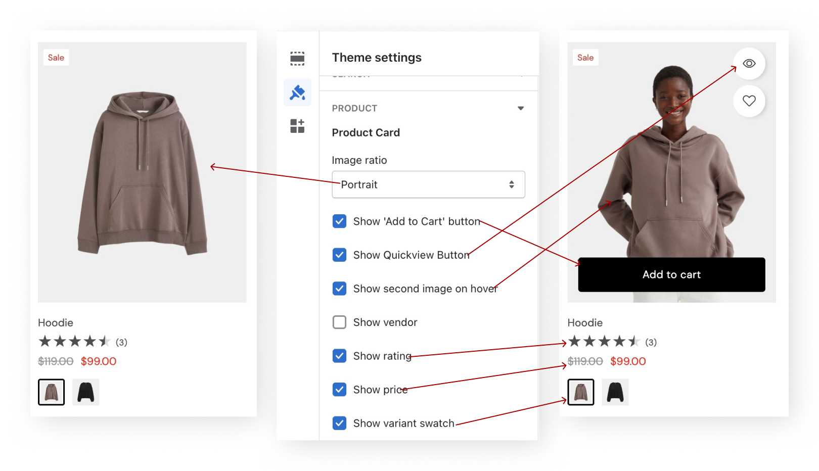
Product Card
The product card in this theme can be customized with the following settings.
- Image ratio (options: adapt, square, portrait)
Allows you to select image ratio. For best result, upload product image with same ratio as option you choose. - Show "Add to cart" button
When user hover a product card, this button will be shown on top of the image. - Show Quickview button
- Show second image on hover
If a product has more than 1 image, the second image will be visible when user hover a product card - Show vendor
Show the product vendor or brand with link to a page that contains products with same vendor or brand - Show price
Shows the product price
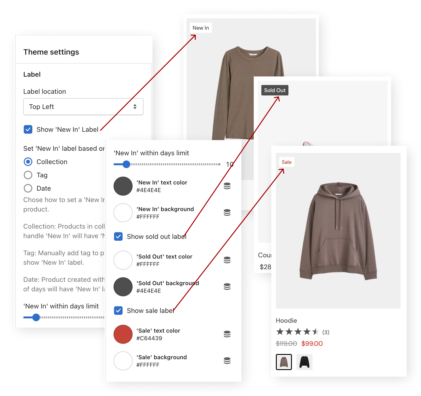
Label
A product card can have 3 labels, New in, Sold out, and Sale. These labels will be shown based on the product state or attributes like the following.
New in
New in label can be shown based on product tag, collection, or date. You need to chose which attribute that will define a product as a 'New In'. By default, product in collection 'New In' will have label 'New In'.
Sold out
Product has zero available quantity
Sale
Product price is lower than "compare at price"
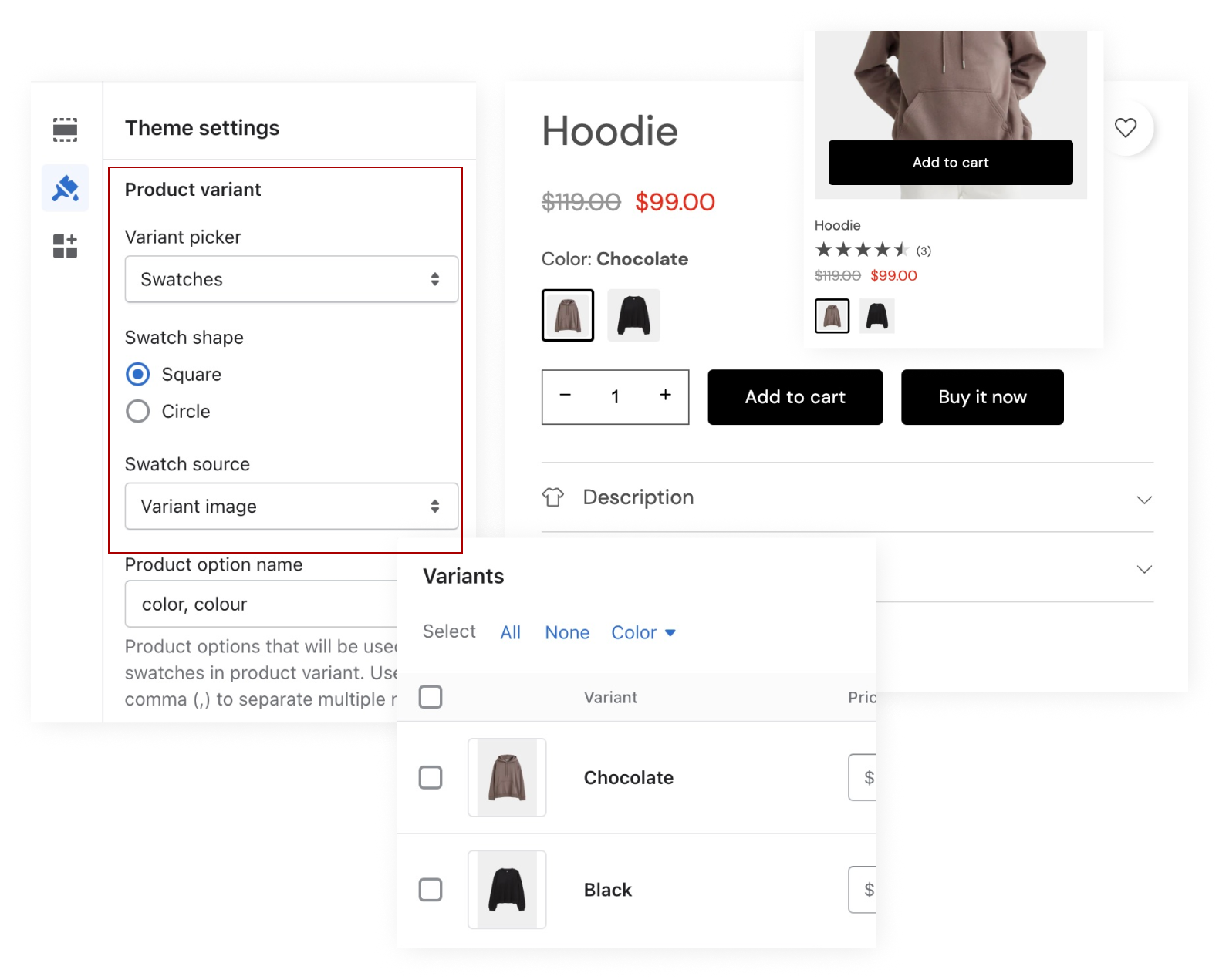
Product Swatch
To activate product swatch, choose swatches as variant picker in Theme settings > product > Product variant
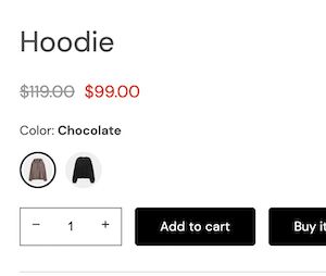
Product swatches has 2 attributes shape and source. The shape can be square and circle. The source can be variant image like the following image, standard color, and custom uploaded image.
Product swatches has 2 shapes square and circle. This is product swatch with circle shape.
Standard color
This product swatch use standard color, Beige and Pink. Standard colors are 140 named colors supported by modern browsers. Learn more about these colors.
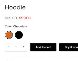
If you choose standard color for the swatch source, make sure your product variant name is listed in these standard colors.
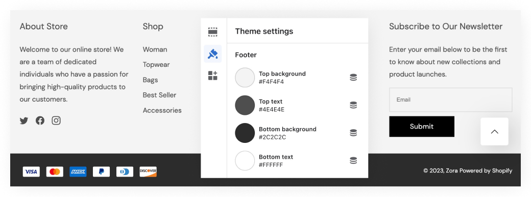
Footer
To customize footer colors, go to Theme settings > Colors > Footer
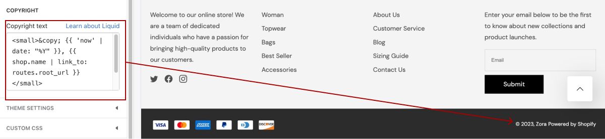
Customize Copyright Text
You can customize the copyright text with liquid code, html, or plain text. Go to Footer section setting and find Copyright text input field.